Inspo by Nyabag · Developer tools
WorkOS website design
WorkOS uses a split hero: a two-line headline with "Enterprise Ready" set in a soft violet gradient on the left, and a floating stack of toggle cards on the right that reads like a settings panel for SSO and SCIM. A grayscale logo grid of AI companies follows as social proof. The feature area pairs short headings with isometric, glassy illustrations and a tidy two-column list of capabilities, each with a small icon tile. It is a calm, light, developer-friendly take on enterprise selling.
 Save to Nyabag

WorkOS sections
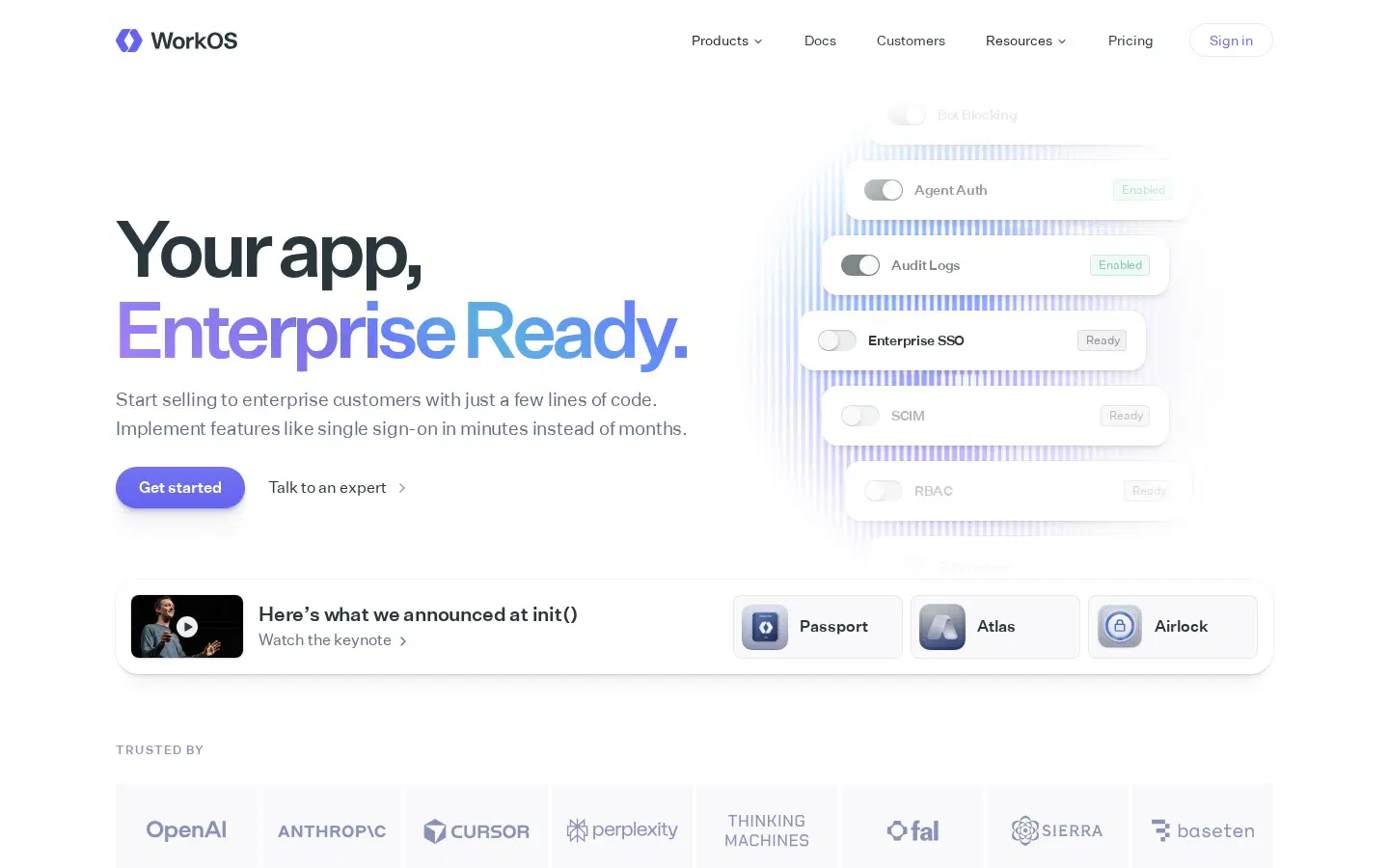
Hero 
Logos & stats 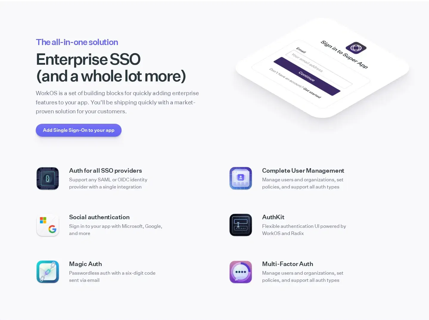
Features 
Testimonials 
Footer
More developer tools website designs
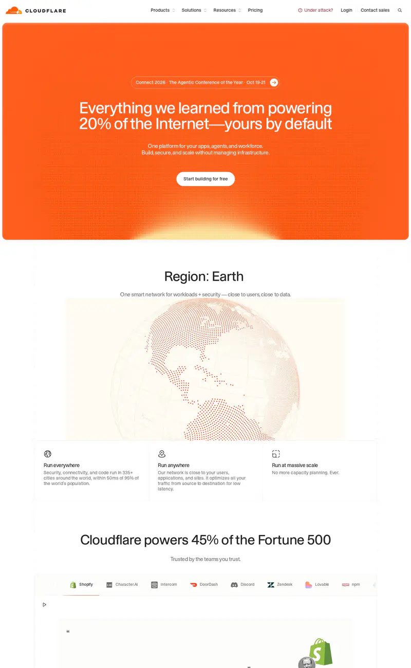
Cloudflare
Developer tools · LightCloudflare puts its whole hero inside a big orange block: a centered white headline about powering 20% of the Internet, one supporting line, and a white button, with a subtle sunrise glow at the bottom edge.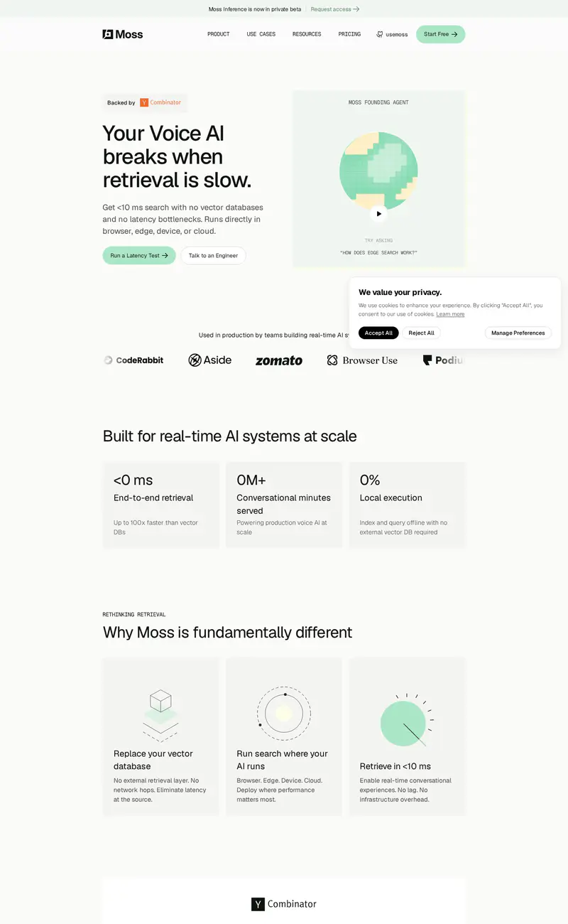
Moss
Developer tools · LightMoss uses a light, airy layout with pastel greens: a left-aligned headline ("Your Voice AI breaks when retrieval is slow") and a pixel-art illustration of a growing tree inside a soft green card.
Supabase
Developer tools · LightSupabase uses a clean, light layout with its signature green as the only accent.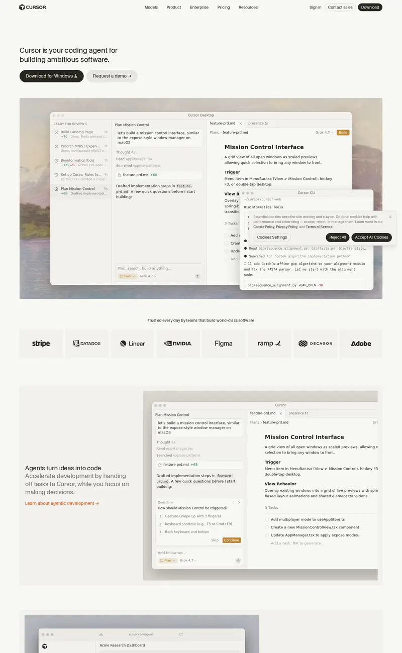
Cursor
Developer tools · LightCursor's page is understated: a small headline ("Cursor is your coding agent for building ambitious software") with two buttons, then a large product screenshot of the editor and agent panel placed over a soft, painted landscape background.
Sentry
Developer tools · DarkSentry stays loud and fun: a deep purple night sky, a bold headline where "breaks," is set in a jagged, broken style, and an illustrated astronaut fixing a UFO in the middle.
Trigger.dev
Developer tools · DarkTrigger.dev's page is dark with a neon green accent.