Inspo by Nyabag · Productivity
Cal.com website design
Cal.com keeps its hero on a light gray canvas with a large black headline ("The better way to schedule your meetings") and a black Google sign-up button on the left, and a live booking widget with a calendar grid on the right. Review stars and a logo row sit below. Feature cards use small, monochrome illustrations of calendars and availability. Black, white and gray with almost no color, letting the scheduling UI read clearly.
 Save to Nyabag

Cal.com sections
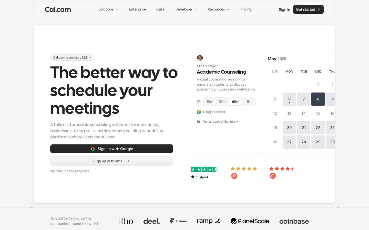
Hero 
Logos & stats 
Features 
Bento 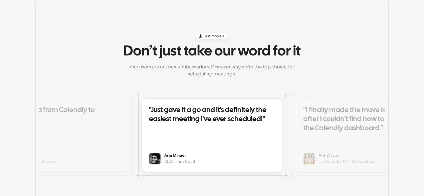
Testimonials 
FAQ 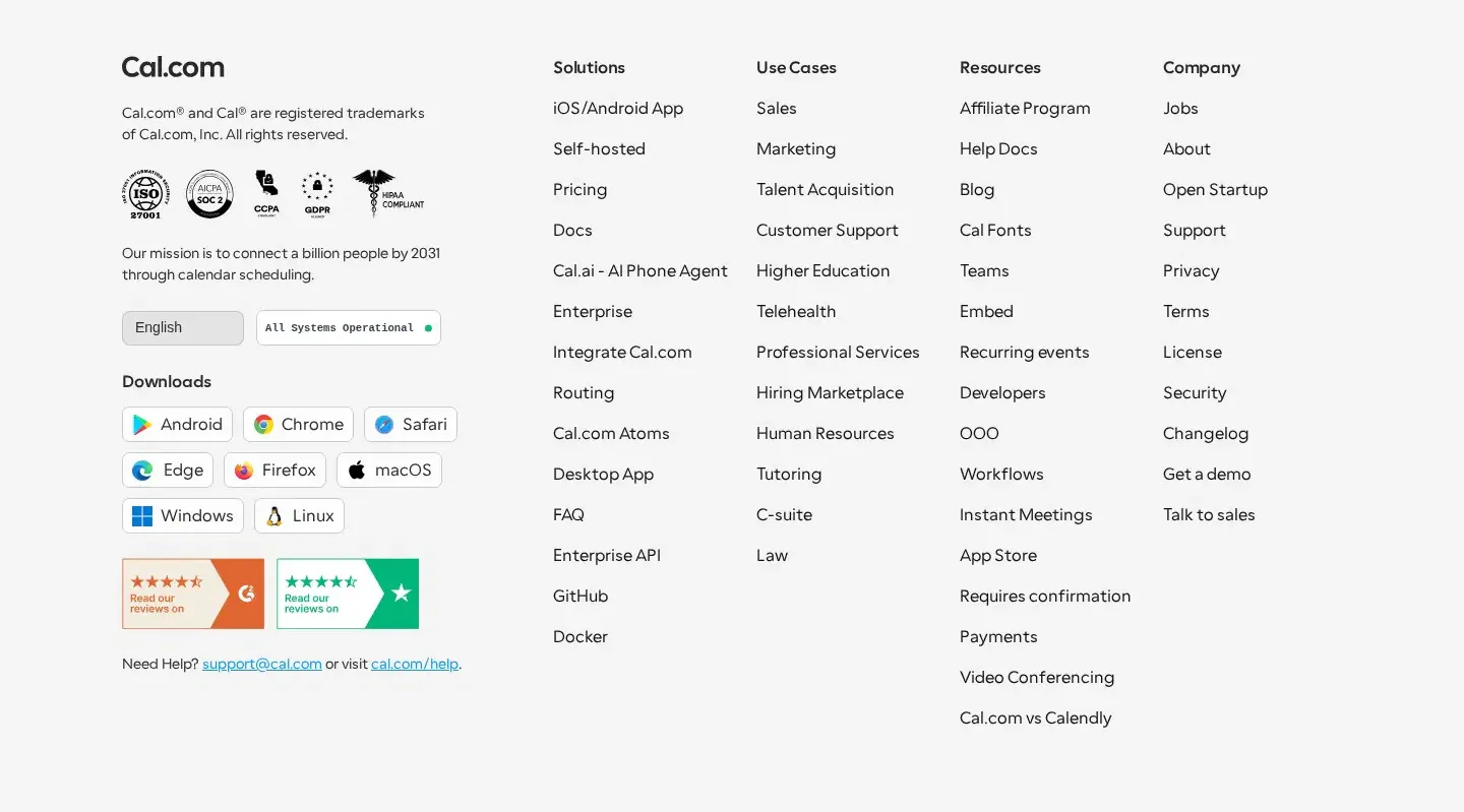
Footer
More productivity website designs
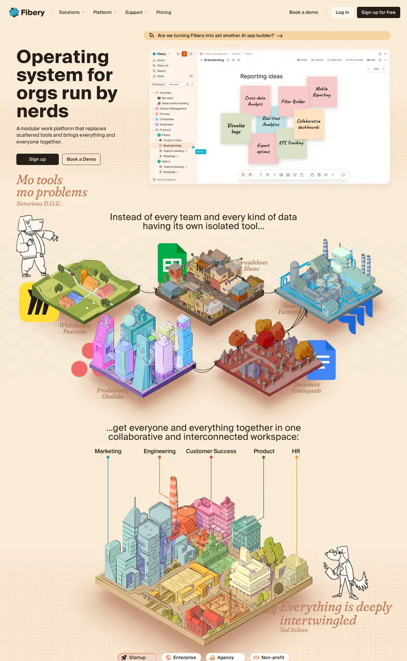
Fibery
Productivity · LightFibery breaks from SaaS sameness with a warm cream background, a heavy black headline ("Operating system for orgs run by nerds") and italic serif asides in rust, set like magazine pull quotes.
Calendly
Productivity · LightCalendly keeps its hero light and centered: a two-line headline in a warm, slightly editorial typeface ("All the work around meetings, handled."), followed by side-by-side Google and Microsoft sign-up buttons.
Notion
Productivity · LightNotion pairs a large centered headline ("Where teams and agents think together") with its familiar hand-drawn character illustrations peeking around the product window.
Linear
Productivity · DarkLinear's page is near-black with soft gray type.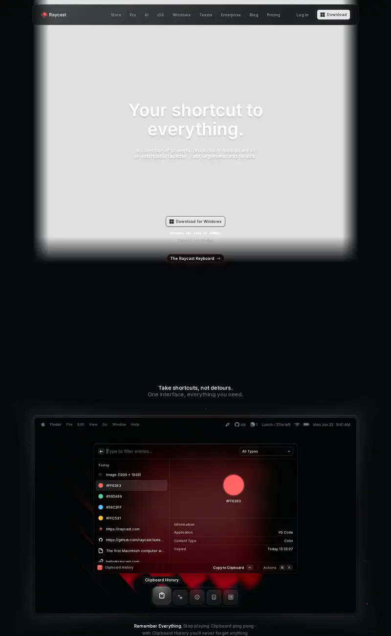
Raycast
Productivity · DarkRaycast's page is dark and atmospheric.
Pitch
Productivity · LightPitch uses a soft violet gradient across the whole top of the page.