Inspo by Nyabag · Productivity
Pitch website design
Pitch uses a soft violet gradient across the whole top of the page. In this capture the hero visuals are still fading in, but the structure is clear: a prompt input to generate a presentation sits in the middle, surrounded by blurred slide previews, with a pale logo row underneath. The airy, pastel gradient and translucent cards suit a presentation tool that wants to feel creative and light.
 Save to Nyabag

Pitch sections

Hero 
Features 
FAQ 
CTA 
Footer
More productivity website designs
Fibery
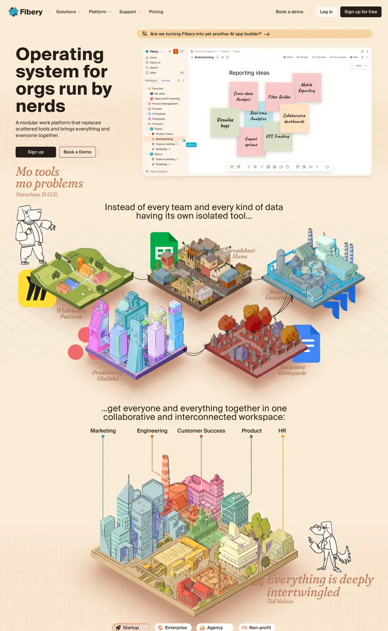
Productivity · LightFibery breaks from SaaS sameness with a warm cream background, a heavy black headline ("Operating system for orgs run by nerds") and italic serif asides in rust, set like magazine pull quotes.
Calendly
Productivity · LightCalendly keeps its hero light and centered: a two-line headline in a warm, slightly editorial typeface ("All the work around meetings, handled."), followed by side-by-side Google and Microsoft sign-up buttons.
Notion
Productivity · LightNotion pairs a large centered headline ("Where teams and agents think together") with its familiar hand-drawn character illustrations peeking around the product window.
Linear
Productivity · DarkLinear's page is near-black with soft gray type.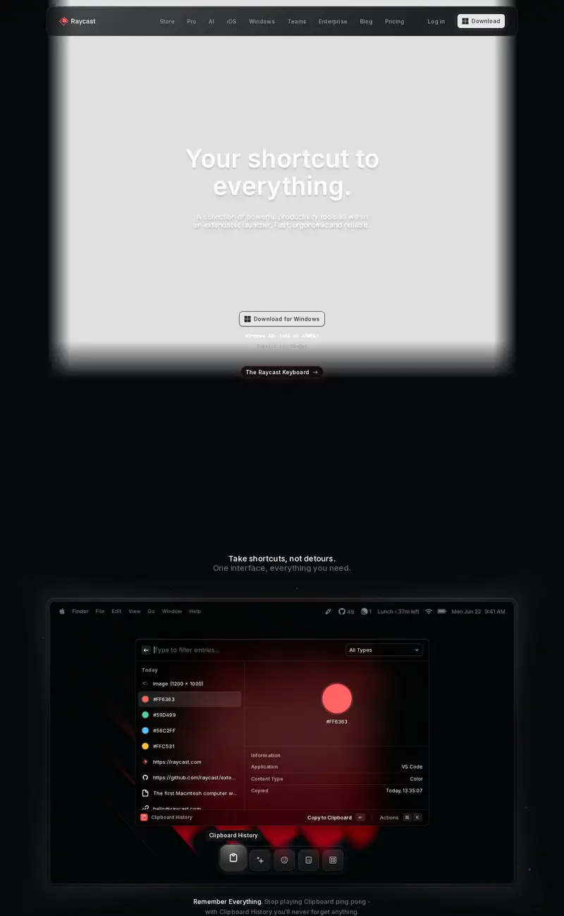
Raycast
Productivity · DarkRaycast's page is dark and atmospheric.
Cal.com
Productivity · LightCal.com keeps its hero on a light gray canvas with a large black headline ("The better way to schedule your meetings") and a black Google sign-up button on the left, and a live booking widget with a calendar grid on the right.