Inspo by Nyabag · Security
Tines website design
Tines turns a security product into a poster. A pale lilac background carries a two-line headline in deep blue, then a giant "100x" rendered in dense, colorful folk-art patterns fills the screen. A product dashboard overlaps the lower half, and later sections bring in hand-drawn robot and creature illustrations with serif headlines. The mix of ornate illustration and serious workflow UI is distinctive and shows that enterprise security does not have to look sterile.
 Save to Nyabag

Tines sections

Hero 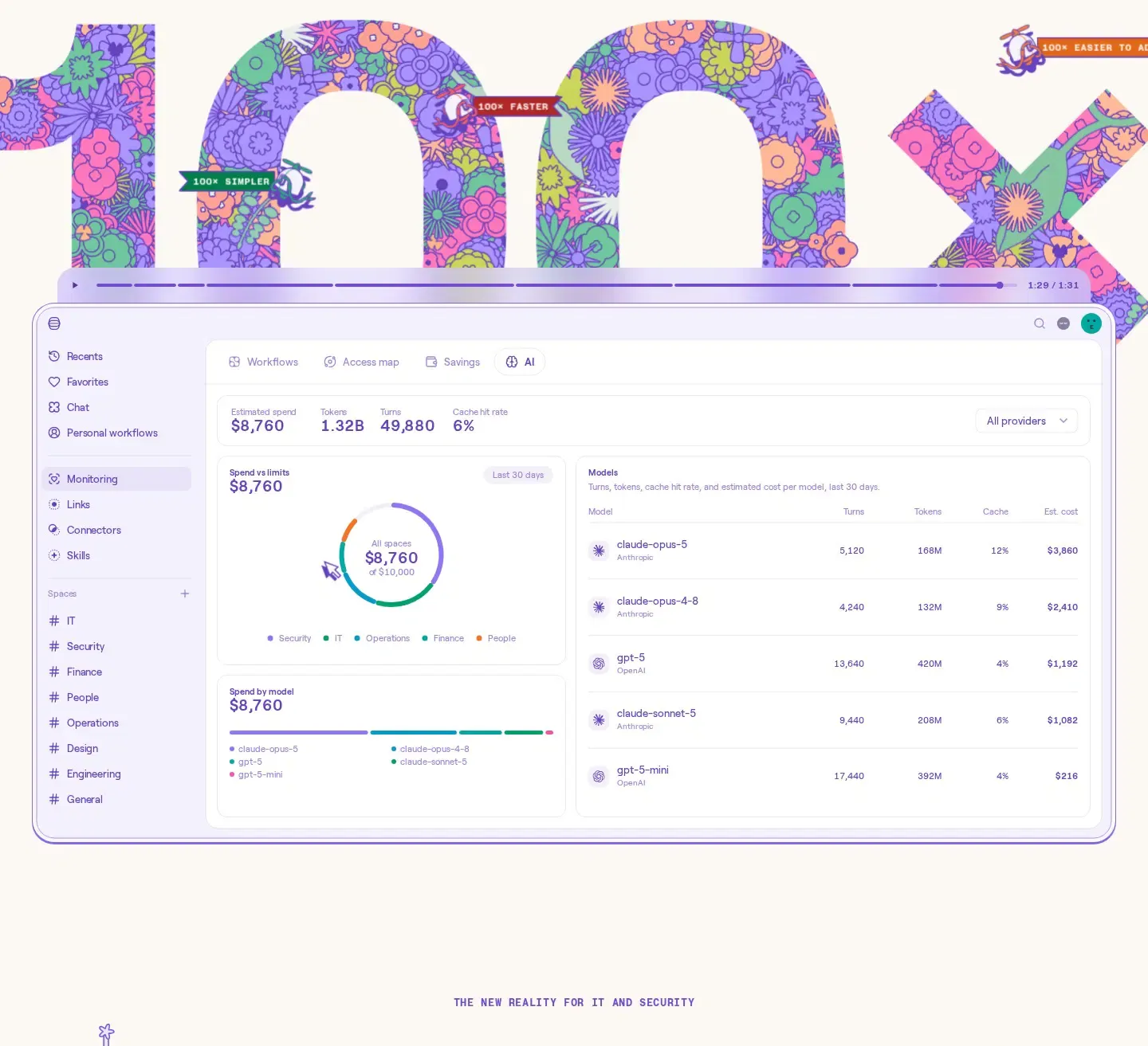
Logos & stats 
Features 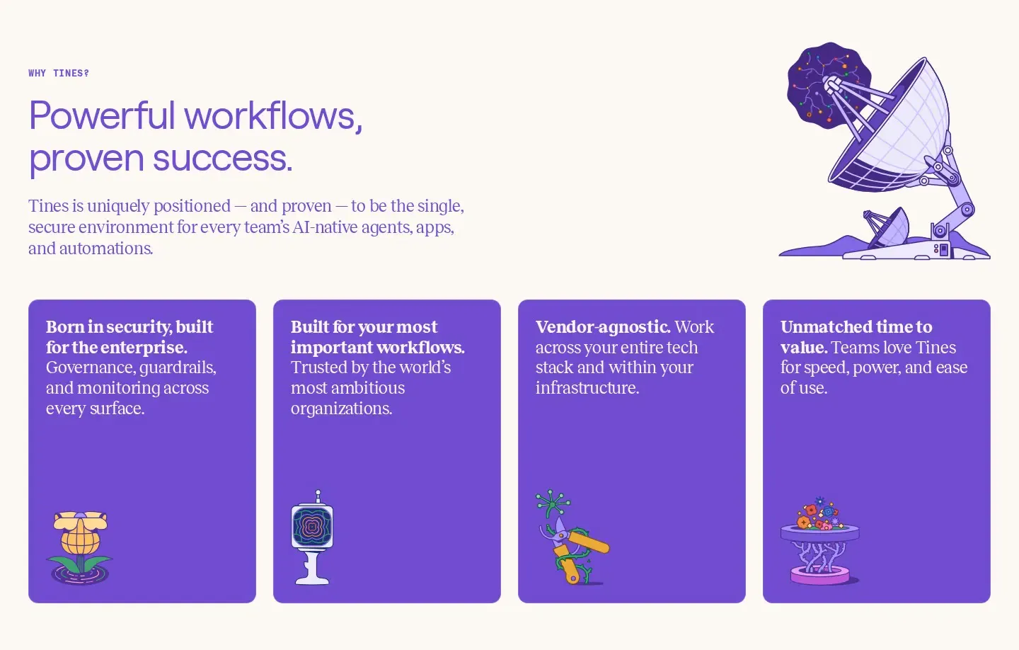
Bento 
CTA 
Footer
More SaaS website designs

Mobbin
Design tools · LightMobbin opens on a centered, three-line headline that drops tiny brand marks (Airbnb, Duolingo) inline between the words, a playful way to signal who uses the library without a logo wall.
Humblytics
Analytics · LightHumblytics leads with a plain, centered headline and pushes the proof into a dense product mock directly under it: a revenue table, A/B variants and conversion numbers.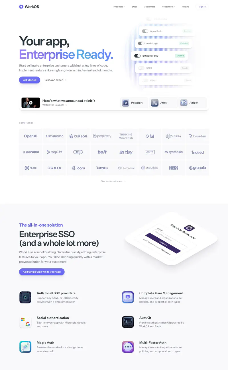
WorkOS
Developer tools · LightWorkOS uses a split hero: a two-line headline with "Enterprise Ready" set in a soft violet gradient on the left, and a floating stack of toggle cards on the right that reads like a settings panel for SSO and SCIM.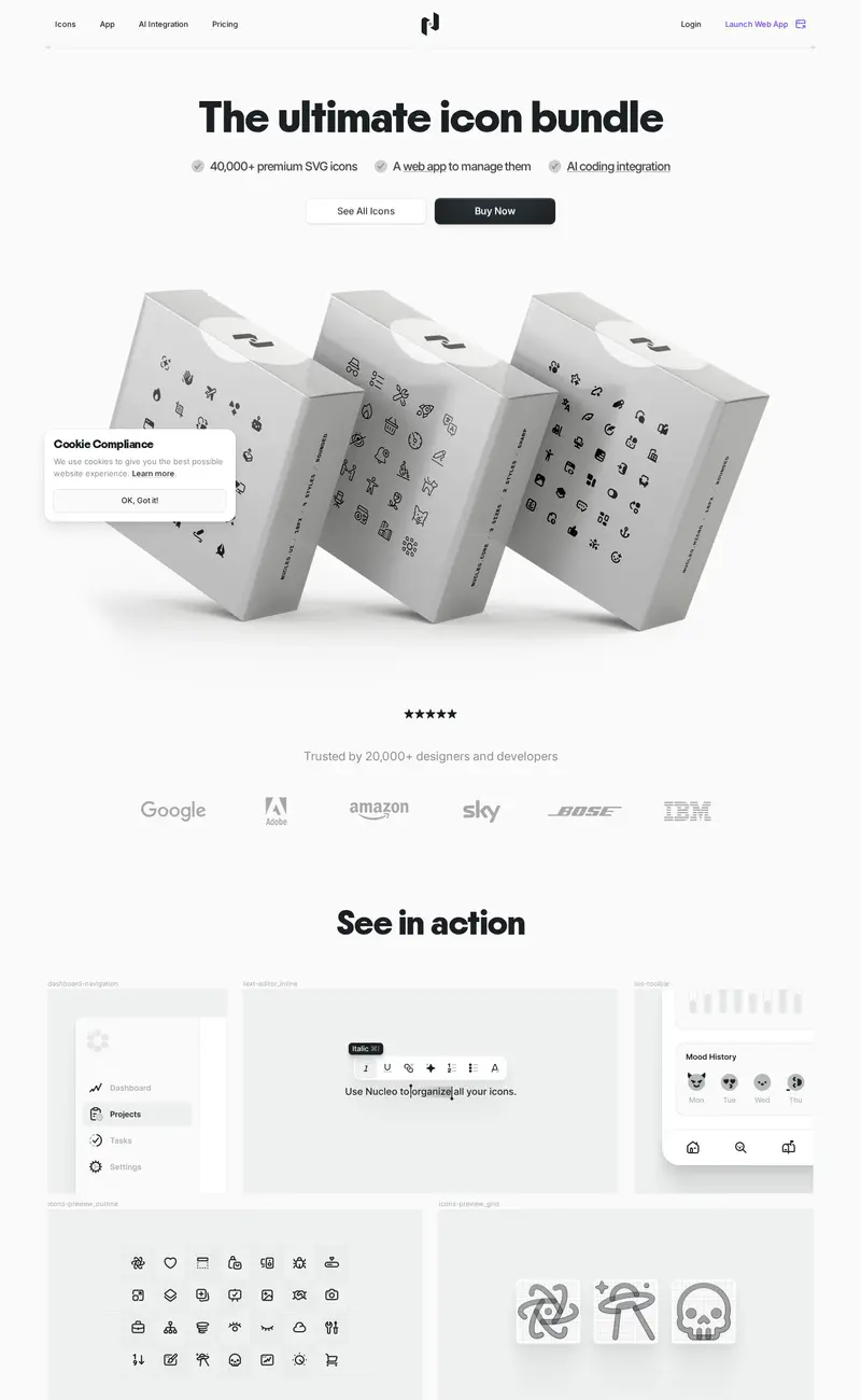
Nucleo
Design tools · LightNucleo sells an icon library with a 3D product shot: white boxes printed with icon patterns, tumbling across a pale gray hero under a bold "The ultimate icon bundle" headline.
Glide
No-code · LightGlide pairs a plain, two-line headline ("Stop chasing spreadsheets") with an unexpected hero visual: a detailed architectural photo of a building under construction, a metaphor for apps built from data.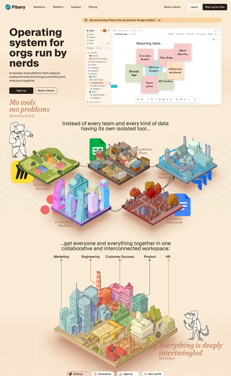
Fibery
Productivity · LightFibery breaks from SaaS sameness with a warm cream background, a heavy black headline ("Operating system for orgs run by nerds") and italic serif asides in rust, set like magazine pull quotes.