Inspo by Nyabag · Analytics
Visitors website design
Visitors uses a soft lilac-to-white gradient behind a centered headline ("Revenue-first web analytics") and a compact pill navigation. The hero is a single clean analytics card with a line chart and a funnel, floating on the gradient. Three small feature points (lightweight script, five-minute setup, independent) sit beneath it, and later sections use two-column cards with tiny colored icons. A lightweight, friendly page for a privacy-focused analytics tool.
 Save to Nyabag

Visitors sections

Hero 
Logos & stats 
Bento 
Features 
Pricing 
FAQ 
CTA 
Footer
More analytics website designs

Humblytics
Analytics · LightHumblytics leads with a plain, centered headline and pushes the proof into a dense product mock directly under it: a revenue table, A/B variants and conversion numbers.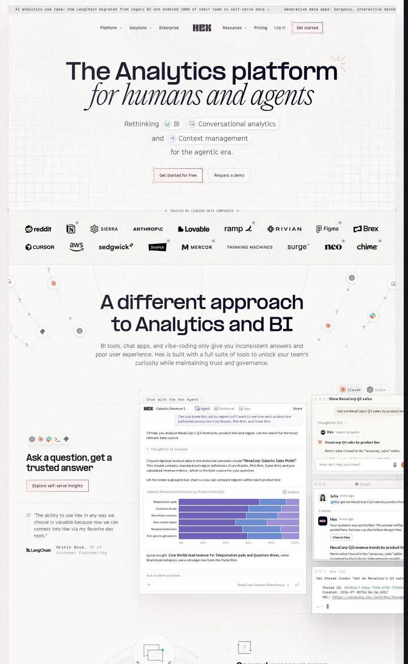
Hex
Analytics · LightHex uses a light, warm white page with a faint grid.
Mobbin
Design tools · LightMobbin opens on a centered, three-line headline that drops tiny brand marks (Airbnb, Duolingo) inline between the words, a playful way to signal who uses the library without a logo wall.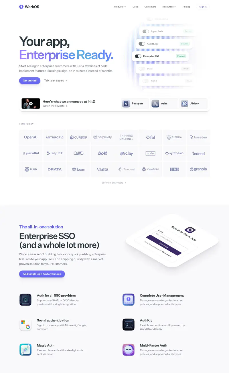
WorkOS
Developer tools · LightWorkOS uses a split hero: a two-line headline with "Enterprise Ready" set in a soft violet gradient on the left, and a floating stack of toggle cards on the right that reads like a settings panel for SSO and SCIM.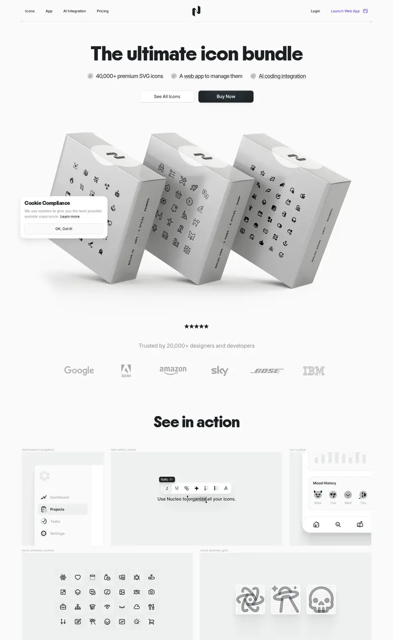
Nucleo
Design tools · LightNucleo sells an icon library with a 3D product shot: white boxes printed with icon patterns, tumbling across a pale gray hero under a bold "The ultimate icon bundle" headline.
Glide
No-code · LightGlide pairs a plain, two-line headline ("Stop chasing spreadsheets") with an unexpected hero visual: a detailed architectural photo of a building under construction, a metaphor for apps built from data.