Inspo by Nyabag · Website builders
Webflow website design
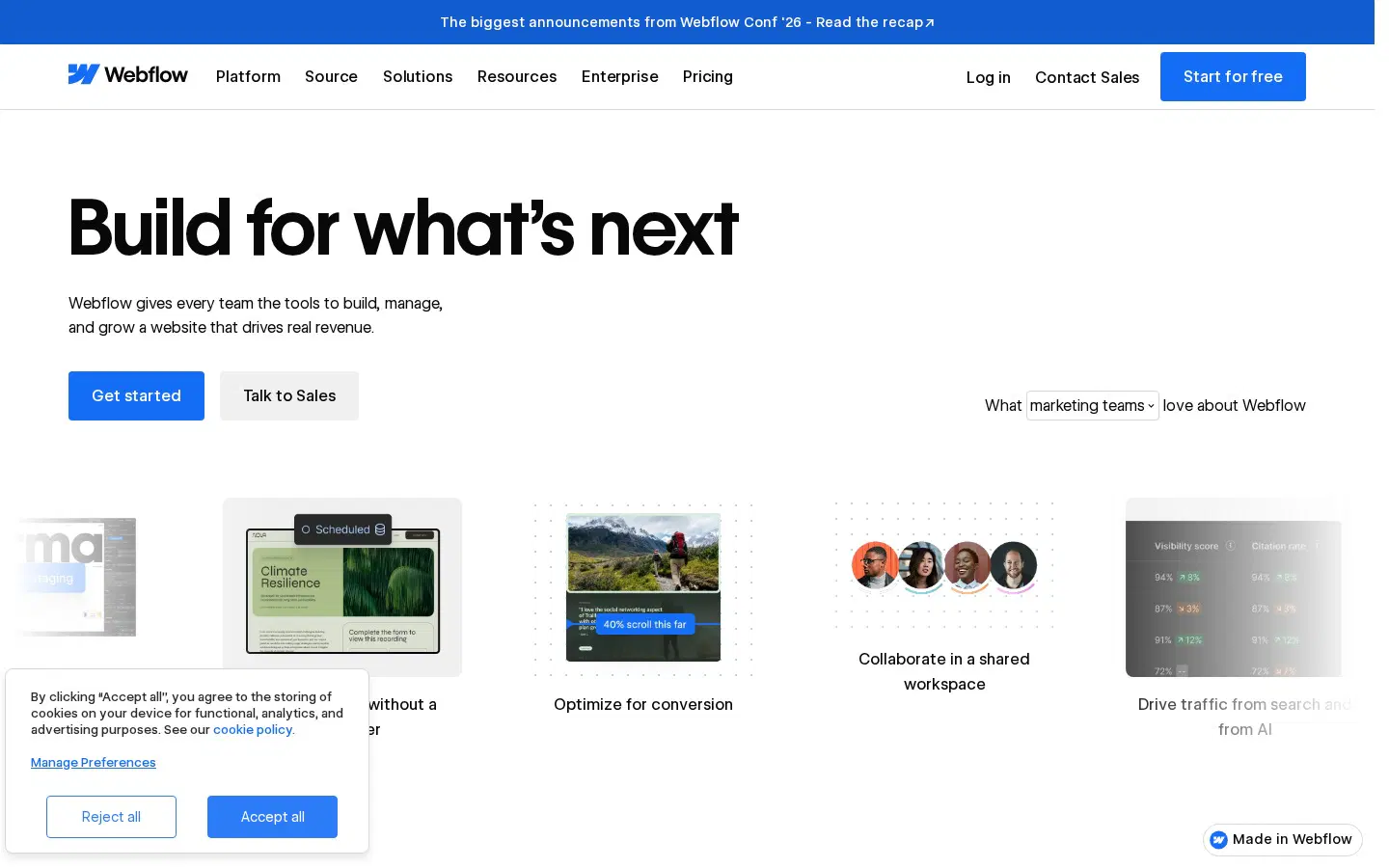
Webflow's hero is crisp and left-aligned: a bold "Build for what's next" headline with a blue button, followed by a horizontal row of product thumbnails and team avatars that preview what you can build. A dense logo grid follows, then a dark product section introducing Webflow Source with a large editor screenshot. Blue is the only accent, used for buttons and links, and the layout leans on strong grid alignment, as you would expect from a site-building tool.
 Save to Nyabag

Webflow sections
Hero 
Logos & stats 
Features 
Testimonials 
Footer
More website builders website designs
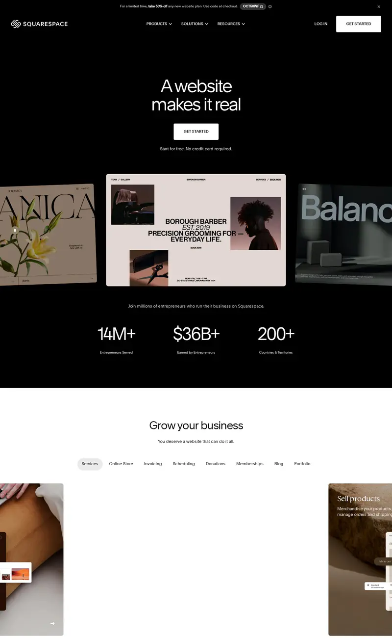
Squarespace
Website builders · DarkSquarespace opens fully black with a short, centered headline ("A website makes it real") and a single white button, then fans out a row of website templates in a horizontal carousel: a barber shop, a botanical studio, a fashion brand.
Framer
Website builders · DarkFramer's page is nearly all black.
Mobbin
Design tools · LightMobbin opens on a centered, three-line headline that drops tiny brand marks (Airbnb, Duolingo) inline between the words, a playful way to signal who uses the library without a logo wall.
Humblytics
Analytics · LightHumblytics leads with a plain, centered headline and pushes the proof into a dense product mock directly under it: a revenue table, A/B variants and conversion numbers.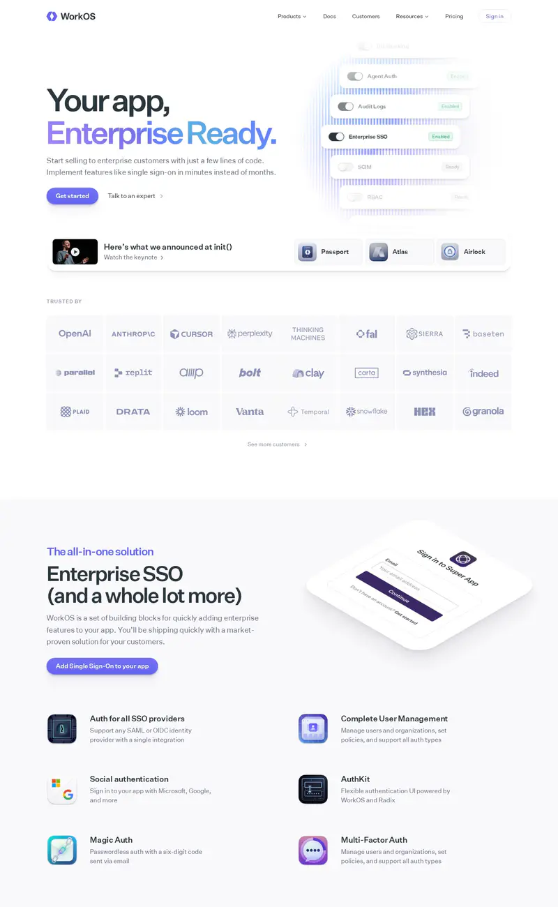
WorkOS
Developer tools · LightWorkOS uses a split hero: a two-line headline with "Enterprise Ready" set in a soft violet gradient on the left, and a floating stack of toggle cards on the right that reads like a settings panel for SSO and SCIM.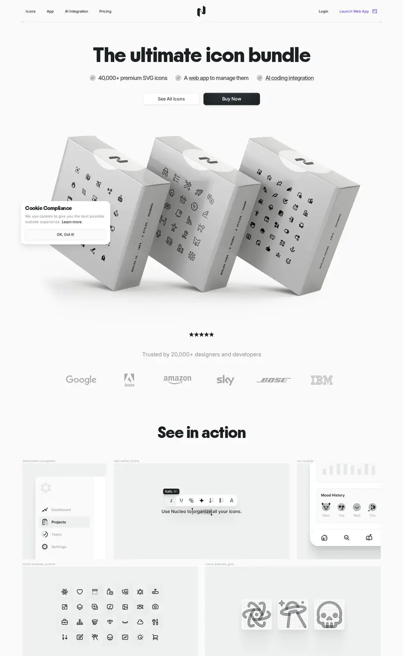
Nucleo
Design tools · LightNucleo sells an icon library with a 3D product shot: white boxes printed with icon patterns, tumbling across a pale gray hero under a bold "The ultimate icon bundle" headline.